India's
premier resume service
India's
premier resume service

🎨 How to Use Color in Your Resume Effectively: A Complete Guide

In today’s job market, making a memorable first impression with your resume is more important than ever. While layout and content are critical, the strategic use of color can make your resume visually appealing, improve readability, and express your personal brand.
But using color on your resume is a balancing act. Done right, it can highlight important information and help you stand out from a sea of black-and-white documents. Done wrong, it can appear unprofessional or even cause your resume to be rejected by applicant tracking systems (ATS).
In this detailed guide, we’ll explore why, when, and how to use color in your resume effectively, along with the best color choices, mistakes to avoid, and industry-specific tips.
✅ Why Consider Using Color on Your Resume?
Color on a resume isn’t just a design choice — it can communicate personality, draw attention to key areas, and subtly influence the reader’s perception.
Benefits of Using Color:
- Draw attention to your name, section headers, or contact info
- Guide the reader’s eye to important details
- Enhance readability when used to separate sections
- Reflect your professional identity or creativity
- Make your resume more memorable
🎯 When to Use Color in a Resume
Color is especially useful if you:
- Work in creative, tech, or modern industries
- Want to express your personal brand
- Need to stand out visually in a stack of resumes
- Are submitting your resume directly (rather than through a strict ATS)
However, avoid using color if you’re applying in very formal or conservative sectors like:
- Law
- Government
- Finance
🎨 Best Colors to Use in Resumes (And What They Convey)
| Color | Symbolism | Recommended For |
|---|---|---|
| Navy Blue | Trust, professionalism, calm | Corporate, tech, education |
| Dark Green | Growth, balance, renewal | Environment, healthcare, NGOs |
| Burgundy | Sophistication, leadership | Business, management, sales |
| Gray | Neutrality, modernity, professionalism | Any industry |
| Black | Authority, strength, elegance | All sectors (for text/contrast) |
| Gold | Prestige, success, luxury | Executive roles, design fields |
Avoid colors like red, pink, orange, or neon tones — they can be too loud or distracting.
⚠️ When Not to Use Color on a Resume

❌ If the Job Is in a Very Traditional Field:
Many employers in finance, law, or public administration expect a conservative black-and-white resume.
❌ If You’re Using Complex Resume Design:
Color plus charts, tables, or non-standard fonts can overwhelm ATS.
❌ If It Reduces Readability:
Low contrast between text and background can make your resume hard to read, especially when printed.
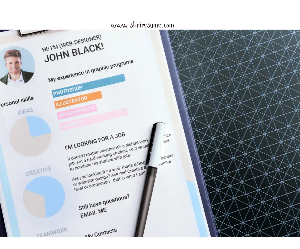
🧠 Where to Add Color on Your Resume
The key is subtlety. Use color strategically in areas like:
- Your name
- Section headers
- Lines/dividers between sections
- Icons or symbols (for phone, email, etc.)
- Sidebars (if using a two-column layout)
Avoid using color in:
- Body text or job descriptions
- Bullet points
- Job descriptions
📌 Pro tip: Use only 1–2 accent colors. Keep your body text in black or dark gray for readability.
🛠 How to Add Color to Your Resume (Step-by-Step)
1. Pick Your Primary Accent Color
Use a color that aligns with your personality and the job role. Navy, dark green, or charcoal are safe choices.
2. Apply It to Key Elements
Apply it to:
- Your name
- Headings like “Experience”, “Education”
- Contact information
3. Maintain Strong Contrast
Make sure text remains legible. Avoid light gray on white or yellow on any light background.
4. Test Before Sending
Check:
- Printed version (in grayscale)
- PDF preview
- ATS readability (avoid colored text in images or infographics)
📁 Resume Template Examples Using Color
| Layout | Color Use |
|---|---|
| Clean + Professional | Navy blue headers, gray subheaders |
| Creative Resume | Sidebar with soft pastel tones, bold name |
| Corporate Resume | Neutral lines and borders in gray |
| Modern Resume | Monochrome with one color accent |
## 📎 ATS Considerations When Using Color
Applicant Tracking Systems (ATS) may not process formatting correctly. To make sure your colorful resume gets through:
- Save and send as a .PDF file (unless specified otherwise).
- Avoid text embedded in images.
- Use web-safe fonts and standard document structure.
- Keep your layout clean with clear section dividers and no complex tables.
📊 Industries Where Color Works Best
| Industry | Color Usage | Advice |
|---|---|---|
| Design & Marketing | ✅ Encouraged | Bold or creative colors can reflect your style |
| Technology | ✅ Safe | Use modern, professional tones (blue, gray) |
| Education | ⚠️ Conservative | Soft greens, blues are okay |
| Law & Finance | ❌ Avoid | Stick to traditional black & white |
| Healthcare | ⚠️ Minimal | Use soft blues or greens only |
💡 Expert Tips for Using Color on Resumes
- ✅ Use high-contrast text – Dark text on a light background is best.
- ✅ Maintain alignment – Keep all sections balanced and well-spaced.
- ✅ Stick to .PDF format – This preserves layout and color consistency.
- ✅ Be industry-aware – Tailor colors based on company culture and job role.
- ✅ Don’t overdo it – Less is more. Let content lead; color should support.
Conclusion
Using color in your resume is a modern way to enhance presentation, showcase creativity, and improve visual structure — when used with purpose.
Whether you’re applying for a tech role, design job, or startup position, the right use of color can create a memorable impression—but only when used thoughtfully and sparingly.
But always remember: content is king. Let color support your achievements, not distract from them.
If you’re unsure, play it safe with a professional, minimal approach. A clean, color-accented resume will still impress — and can make all the difference.

Kshama Sharma - Resume, CV and Cover Letter Writing Expert


Get a higher quality resume format
Our Resume Builder ensures best practices, logic, formatting standards and job matching opportunities from thousands of job boards and portals around the world.
By clicking Start Your Resume, Your are agree to our Terms of use and Privacy Policy